
Health, Demographics, and Superfund Sites in Maryland: A use case for the Environmental Impact Data Collaborative
To demonstrate the power of the Environmental Impact Data Collaborative, we have assembled environmental, health, and demographic data for Maryland to support location-based analyses. We encourage analysts to interface with the Collaborative and its data, building upon our illustrative example.
We leverage three sources of data for this analysis: the PLACES health indicator data from the CDC, superfund sites from the EPA, and a new series of Population Estimates generated here at the Massive Data Institute. We show how to integrate multiple data sources in the EIDC platform, starting with the health data and then adding additional factors one at a time.
The PLACES data has a wide variety of health indicators available. We’ve selected four to start with – Cancer, Chronic obstructive pulmonary disease (COPD), Asthma, and High Blood Pressure. For a first step, we’ve created a table of crude prevalence by county using 2019 data:
| Table 1. Crude Prevalence Rate of Health Outcome | ||||
| County | Cancer | COPD | Asthma | HBP |
| Allegany | 8.1 | 8.9 | 9.7 | 39.2 |
| Anne Arundel | 7.0 | 5.6 | 8.6 | 32.7 |
| Baltimore | 7.3 | 6.3 | 9.5 | 35.5 |
| Baltimore City | 6.3 | 7.2 | 11.8 | 39.8 |
| Calvert | 7.7 | 6.2 | 9.2 | 33.2 |
| Caroline | 7.9 | 8.8 | 10.1 | 37.4 |
| Carroll | 8.1 | 6.2 | 8.5 | 33.4 |
| Cecil | 7.9 | 7.7 | 9.3 | 38.0 |
| Charles | 6.6 | 5.9 | 9.8 | 38.4 |
| Dorchester | 8.7 | 9.2 | 10.5 | 42.3 |
| Frederick | 7.2 | 5.5 | 8.7 | 31.0 |
| Garrett | 9.4 | 9.5 | 9.7 | 39.8 |
| Harford | 7.9 | 6.3 | 8.8 | 35.8 |
| Howard | 6.6 | 4.1 | 7.7 | 30.7 |
| Kent | 9.3 | 8.2 | 9.1 | 39.6 |
| Montgomery | 6.5 | 4.3 | 8.1 | 28.1 |
| Prince George’s | 5.7 | 4.8 | 8.9 | 36.5 |
| Queen Anne’s | 8.6 | 6.8 | 8.5 | 36.3 |
| Somerset | 6.9 | 9.3 | 11.0 | 42.6 |
| St. Mary’s | 6.9 | 6.2 | 9.1 | 34.1 |
| Talbot | 10.4 | 7.6 | 9.0 | 37.9 |
| Washington | 7.6 | 8.4 | 10.1 | 37.9 |
| Wicomico | 6.9 | 7.5 | 10.3 | 37.5 |
| Worcester | 9.8 | 8.1 | 8.9 | 42.6 |
The variation in each indicator between counties can be difficult to assess in a table. Using the EIDC platform, we can quickly and easily map the data to illustrate the variation between counties. Our maps below focus on Asthma, but look for our project to be featured on the EIDC Redivis site in the coming weeks to see how we develop results for the other health outcomes.
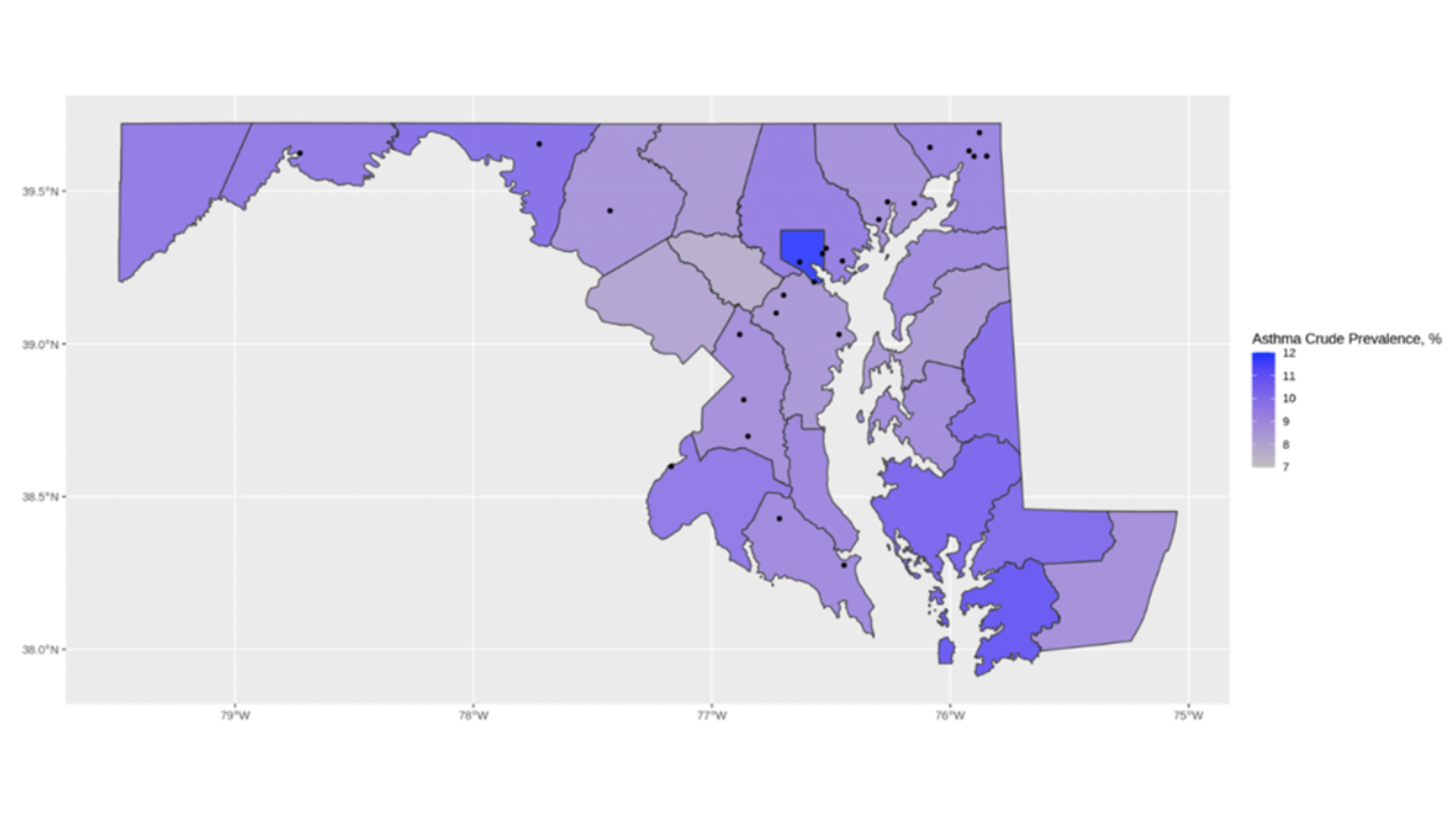
In the map below, we have overlaid superfund site locations. EIDC users can bring their own data (BYOD), linking with our data sources at different levels of geography, from lat-long to county.
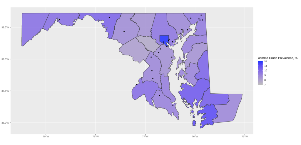
Figure 1. County Asthma Prevalence Compared to Superfund Location staterate.png
Looking at Figure 1, it is clear that Baltimore city–the royal blue county located in the northern center of the state–has the highest asthma prevalence in Maryland. We can also see that there is a cluster of superfund sites in this area. However, we also see areas with high asthma rates and no nearby superfund sites (Somerset county in the southeastern part of Maryland), and counties with multiple superfund sites but median asthma prevalence (Harford and Cecil in northeastern Maryland). While we can’t draw any strong conclusions from this map, we have a useful tool to visually inspect the data and determine where to probe further.
We repeat this analysis with census tracts, focusing on Baltimore (city and county). If we look at a simple table of the top 10 census tracts for asthma prevalence statewide, all of them are in the Baltimore area.
| Table 2. Top Ten Tracts, Asthma Prevalence | |||
| Year | County Name | Tract | Asthma |
| 2019 | Baltimore City | 24510250204 | 17.7 |
| 2019 | Baltimore City | 24510100200 | 17.1 |
| 2019 | Baltimore City | 24510280600 | 16.2 |
| 2019 | Baltimore | 24005490605 | 16.2 |
| 2019 | Baltimore City | 24510190100 | 16.1 |
| 2019 | Baltimore City | 24510280500 | 16.1 |
| 2019 | Baltimore City | 24510170200 | 16.0 |
| 2019 | Baltimore City | 24510150100 | 15.8 |
| 2019 | Baltimore City | 24510140200 | 15.8 |
| 2019 | Baltimore City | 24510160200 | 15.6 |
Tract identifiers aren’t exactly a meaningful point of reference for most people, so we also mapped the asthma prevalence for the Baltimore area tracts.
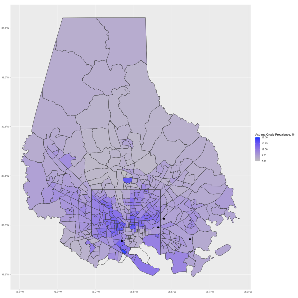
Figure 2. Baltimore Asthma Prevalence Compared to Superfund Location baltrate.png (The white tracts have no health data – they are industrial, water, or wooded areas).
This map shows trends that were not revealed in the county-level maps. High asthma prevalence is concentrated in tracts in and around Baltimore city. Even within the city, the prevalence is not spread evenly – it is more concentrated towards the center of the city, although notably, the very center of the city actually has lower prevalence. The superfund sites are also present on this map, although the point information is not sufficient to draw any interesting conclusions.
From here, we dig a little deeper into the superfund locations. First, we step away from the health indicators to show that the level of geography matters with this data, too.
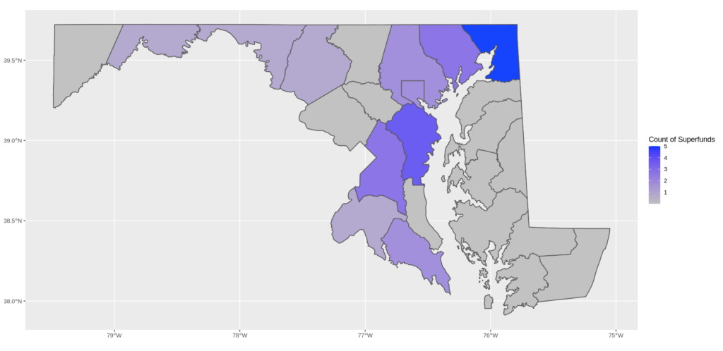
Figure 3a. Number of Superfund Sites, by County sfcount.png
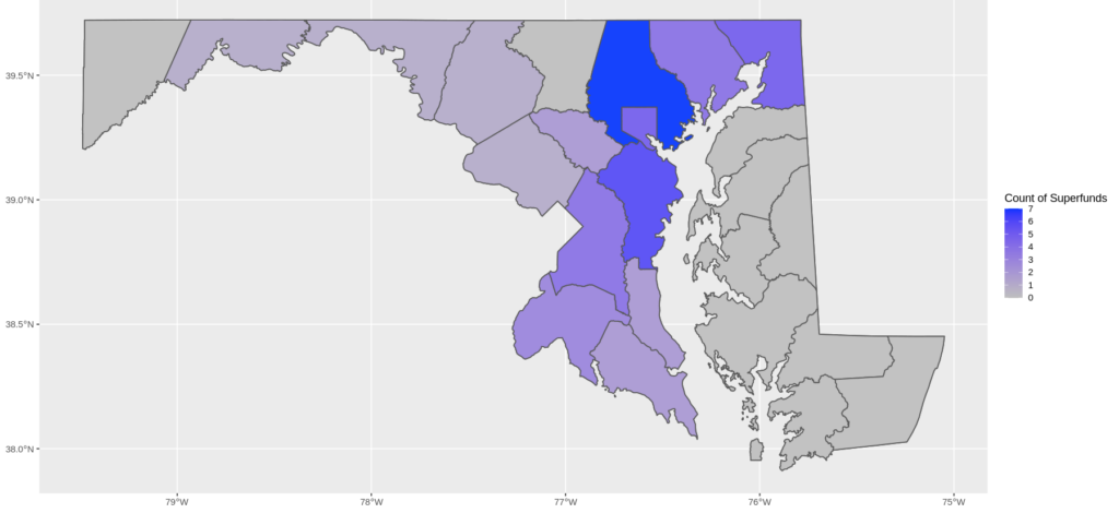
Figure 3b. Number of Superfund Sites Within 5-Mile Radius, by County sf5.png
Shifting our focus to the raw count of superfund sites per county, Cecil County in the upper right corner stands out. Environmental impacts don’t respect borders though, so our next step is to look at how many superfund sites a county is close to. For the purpose of this example, we’ve arbitrarily chosen 5 miles as our definition of “close”. A researcher conducting a formal study might choose this definition based on the type of environmental hazard or geographic features that influence the movement of air and water, but the EIDC platform makes it easy to set and modify such parameters for spatial analyses.
When we change the analysis to focus on proximity to superfund sites, Baltimore County stands out: while Cecil County has the most superfund sites within its borders, Baltimore County has more superfund sites within its borders and nearby. Note that our illustrative example is looking only at Maryland, and this analysis could change when superfund sites in adjacent areas of Virginia, West Virginia, Pennsylvania or Delaware are included.
We can apply the same proximity filter to our tract level analysis of Baltimore city and county. Figure 4 shows the difference between a simple analysis of superfund location and superfund proximity. Four tracts in the Baltimore area contain superfund sites, but we can see that significantly more tracts may be within 5 miles of any one of these sites (light blue tracts), and one tract is within 5 miles of 5 different sites (including one in nearby Anne Arundel county, not shown).
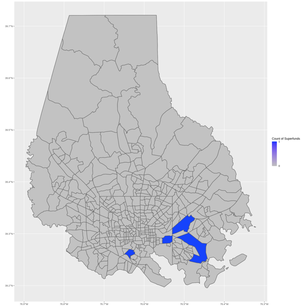
Figure 4a. Baltimore Tracts with Superfund Sites sftract.png
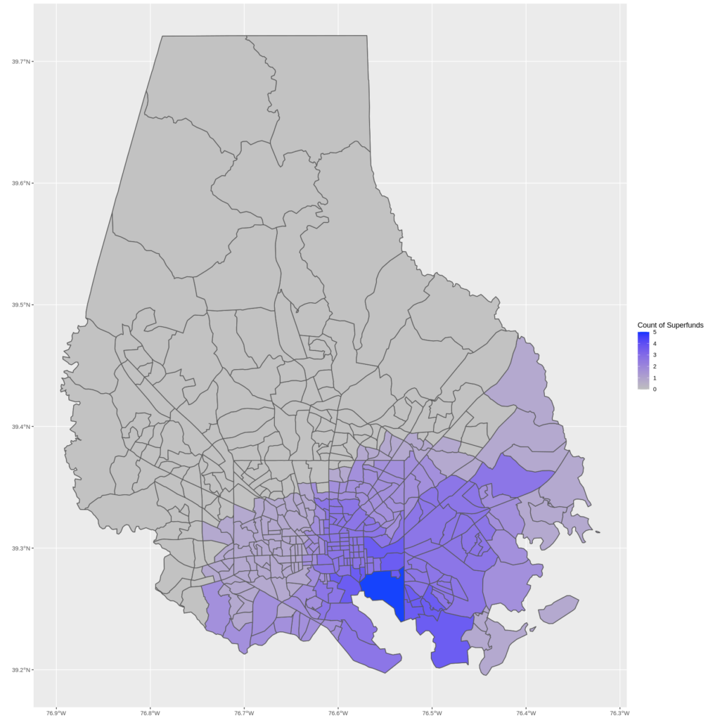
Figure 4b. Baltimore Tracts Within 5 Miles of a Superfund Site sftract5.png
By changing the level of geography, we can see that even though Baltimore County has a high count of nearby superfund sites, they are clustered around Baltimore City. We can also see that the single tract with the highest number of nearby superfund sites is actually within the boundaries of Baltimore City.
Finally, we combine our analyses, to indicate where asthma prevalence coincides with superfund site areas. The result is far more interesting than the map with asthma prevalence and the point locations of superfunds. When we formally account for proximity, we do see significant overlap between the high asthma prevalence in eastern Baltimore and the tracts near a larger number of superfund sites.
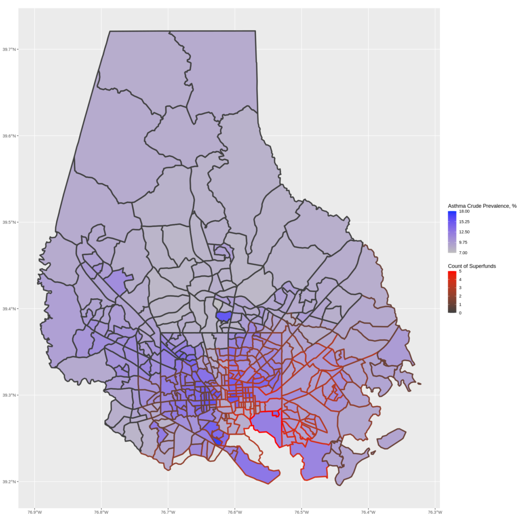
Figure 5. Asthma Prevalence and Superfund Count Have Some Overlaps sfasthma.png
We’ve looked at where the superfund sites are and how they overlap with various health indicators, and now introduce characteristics of the population in these areas. This is where the population estimates come in.
MDI has developed new population estimates for the EIDC. These estimates are timelier and offer greater detail than the ACS estimates. We’re using just a few race and ethnicity categories as an example, but you can see all the data that’s available in the EIDC.
| Table 3. Asthma Prevalence and Selected Demographics | |||
| County | Asthma Crude Prevalence | Percent Black or African American | Percent Hispanic |
| Howard | 7.7 | 19 | 8 |
| Montgomery | 8.1 | 18 | 21 |
| Queen Anne’s | 8.5 | 6 | 5 |
| Carroll | 8.5 | 4 | 5 |
| Anne Arundel | 8.6 | 17 | 10 |
| Frederick | 8.7 | 10 | 12 |
| Harford | 8.8 | 14 | 5 |
| Prince George’s | 8.9 | 59 | 21 |
| Worcester | 8.9 | 12 | 4 |
| Talbot | 9.0 | 11 | 9 |
| Kent | 9.1 | 15 | 6 |
| St. Mary’s | 9.1 | 14 | 6 |
| Calvert | 9.2 | 13 | 5 |
| Cecil | 9.3 | 7 | 5 |
| Baltimore | 9.5 | 30 | 7 |
| Garrett | 9.7 | 1 | 1 |
| Allegany | 9.7 | 8 | 2 |
| Charles | 9.8 | 49 | 7 |
| Washington | 10.1 | 11 | 7 |
| Caroline | 10.1 | 13 | 9 |
| Wicomico | 10.3 | 27 | 7 |
| Dorchester | 10.5 | 28 | 6 |
| Somerset | 11.0 | 38 | 4 |
| Baltimore City | 11.8 | 57 | 8 |
We’ve added race and ethnicity to our earlier table of asthma rates, and once again we can make an observation about Baltimore – the city in particular has a high percentage of Black or African American population.
| Table 4. Top 10 Baltimore Tracts for Asthma Prevalence with Selected Demographics | |||
| Tract ID | Asthma Crude Prevalence | Percent Black or African American | Percent Hispanic |
| 24510250204 | 17.7 | 95 | 1 |
| 24510100200 | 17.1 | 92 | 2 |
| 24510280600 | 16.2 | 91 | 2 |
| 24005490605 | 16.2 | 36 | 7 |
| 24510190100 | 16.1 | 88 | 5 |
| 24510280500 | 16.1 | 90 | 3 |
| 24510170200 | 16.0 | 88 | 2 |
| 24510150100 | 15.8 | 93 | 2 |
| 24510140200 | 15.8 | 86 | 2 |
| 24510200400 | 15.6 | 89 | 4 |
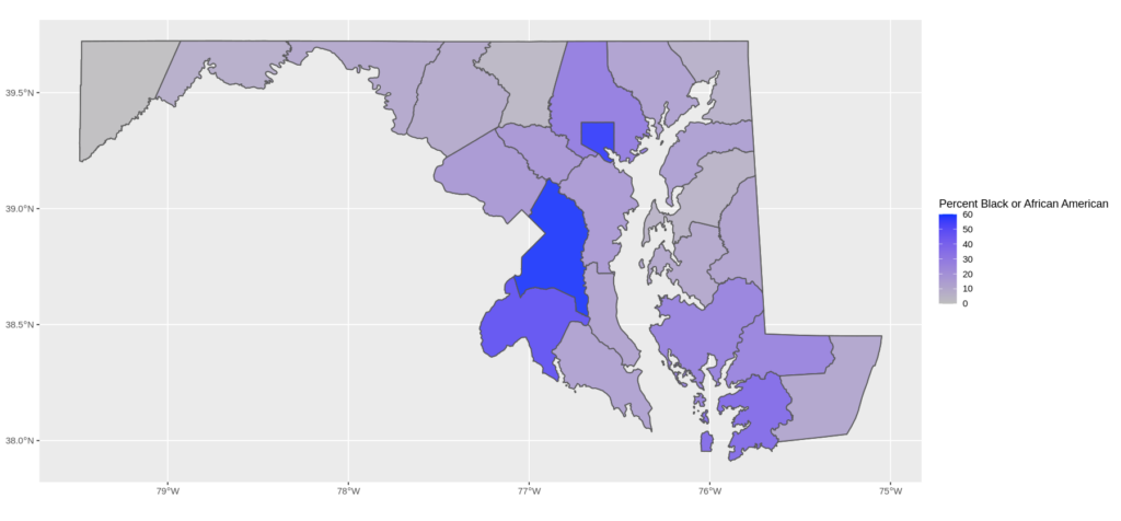
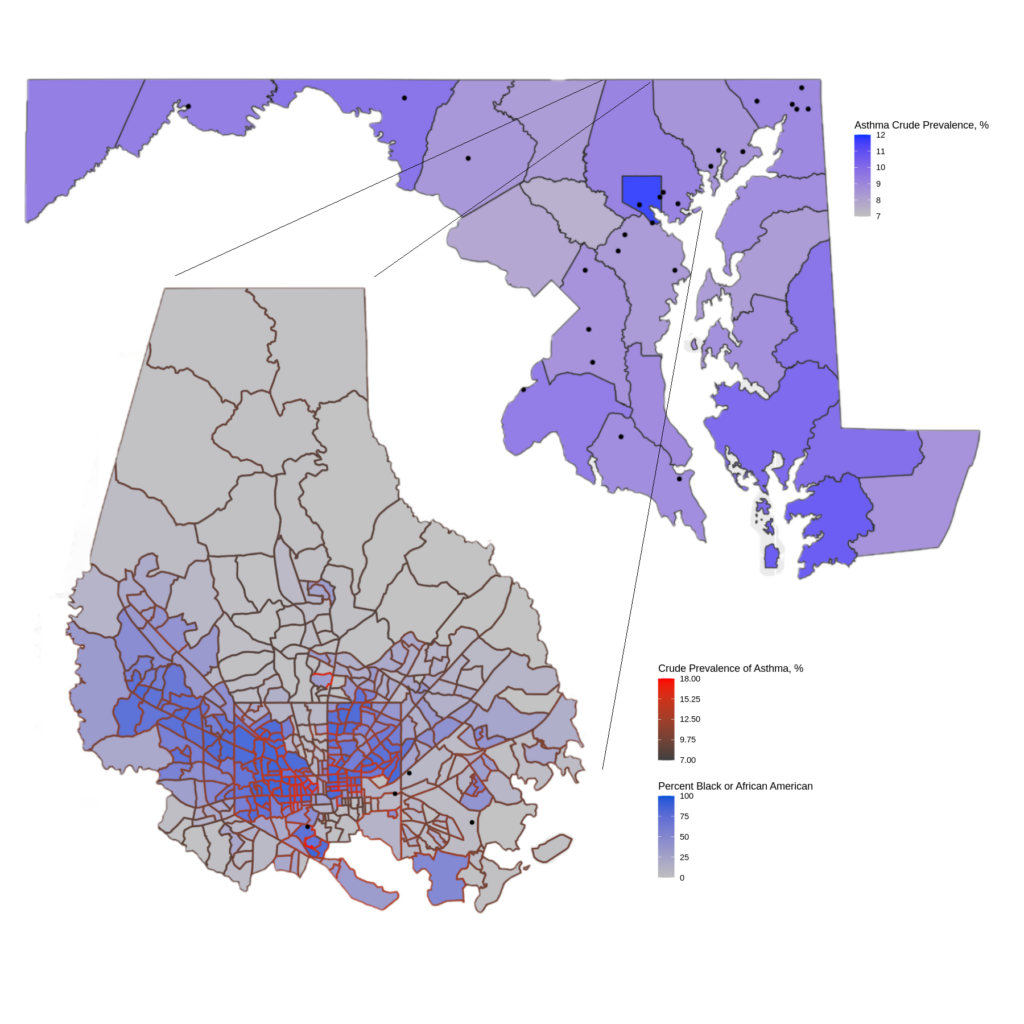
Figure 6. Percent Black or African American, by County statedemo.png
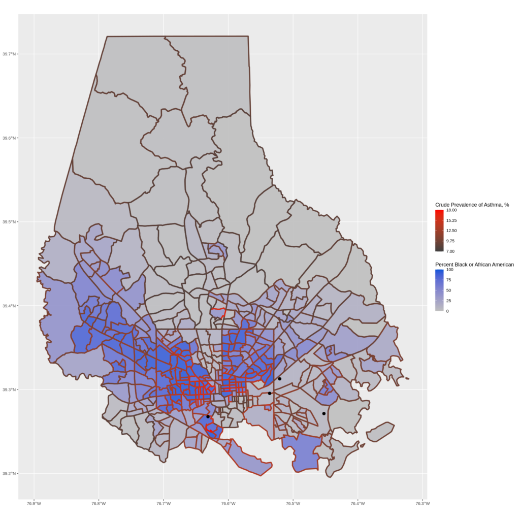
Figure 7. Percent Black or African American, Asthma Prevalence, and Superfund Locations, Baltimore balteverything.png
Returning to the tract level, we see that there is significant overlap between the tracts with high asthma prevalence and high Black or African American population. Recall that the tracts on the eastern half of the city are also near multiple superfund sites. While more rigorous research would need to be done to conclude any causal relationship, the associations depicted here between the superfund site locations, high asthma rates, and high Black or African American populations can suggest that our most marginalized groups bear the brunt of this environmentally hazardous impact.
As stated above, this is meant to be a demonstration of what researchers can do with the EIDC, not a causal or conclusive analysis. There are plenty of avenues to build out an analysis like this:
- Explore the EIDC site to learn about other health indicators in PLACES to consider. There are many more indicators than those listed in Table 1.
- Use the rich, detailed data in the MDI population estimates. These estimates will also be available at the block level, supporting studies of neighborhoods and specific locations.
- Consider studies focusing on other potentially polluted areas in Maryland, including the Eastern Shore and busy beltway and I-95 transportation corridors.
- Check out the EIDC environmental data sources – or import your own! Set up a study notebook to explore the data or invite collaborators.
- While this demonstration has shown some interesting maps, the EIDC platform can also be used to produce other insights and results, such as descriptive statistics and regression analyses.
All this and more is possible with the EIDC!
Notes:
- EPA provides street addresses of superfund sites, which are often inexact. We manually converted these addresses to coordinates for this analysis. Often the point we have chosen represents an entrance to an area, rather than a centroid. In some cases (such as old landfills) the exact location of the superfund site is no longer obvious.
- The most recent PLACES data uses the Census 2010 geography. We made use of the crosswalk files provided by National Historical GIS [IPUMS NHGIS, University of Minnesota, www.nhgis.org] to align the health data with the population data.
- For PLACES county and tract data, we used Crude Prevalence as the health indicator measure instead of Age-Adjusted Prevalence, given that the PLACES tract data only had Crude Prevalence available.
Written by Ellen Moriarty